Friday, October 22, 2010

Mini Peppers in Holiday Colors


I'm in the holiday mood and felt like painting something with golds and yellows. So I spent an afternoon sketching these peppers in watercolor. Used strathmore plate bristol and my sketching palette. Felt great to be back in the studio.

Friday, August 6, 2010

Stoneware Vase In Watercolor


"Stoneware With Glaze Splatters"
7" x 9" Watercolor

Last weekend I spent an hour in the morning on our back patio painting a large stoneware vase I had set in the sun next to the lawn. I wanted a nice light/shadow pattern to play with. I was in the shade though as it was probably 100 degrees already even at 10 a.m. The vase is one of my husband's beautiful buff-colored stoneware pieces which he forms on the wheel with ribs held on the inside of the cylinder of clay while the vase shape developes. This method creates an outside surface texture that is organic and earthy. It was fun to work with dry-brush watercolor textures on cold press paper to depict pottery that has the same type of surface treatment. This was done in a Canson Montval watercolor sketchbook and was built up with 4-5 glazes layers.


Thursday, July 8, 2010

Sketchbooking From the Tailgate


So I decided to brave the heat and head out to paint on location. I brought lots of water and a spray bottle to mist myself. The temperature has been between 102 and 108 degrees in the afternoon for about a month now so I have been working on oils in the studio primarily. I haven't been setting up an easel out in the field because when I stay in the shade of the top half of the back door of my car I have a larger shade area than with my umbrella. An old paint tarp thrown across the top of the door helps extend the shade as well. The above photo shows a watercolor of the Calico Hills done in a Canson Montval sketchbook. I really like this paper as it has just the right amount of surface texture and sizing. I spent about an hour on the sketch. I had taken an hour to set-up, but to be fair that time included a leisurely eaten breakfast while watching the rock climbers ascend the cliff face to my right.


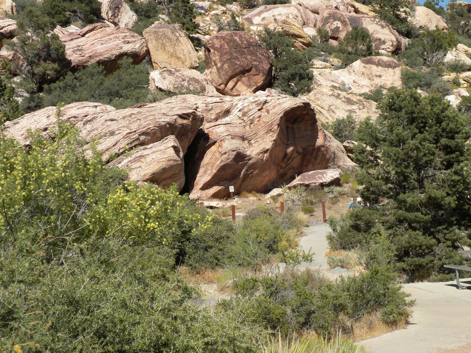
This is a snapshot of the scene I was painting. Most of the plants on these hillsides were consumed in a lightening fire a couple of years ago. But the trees and shrubs in the gully are growing back nicely. I read in the Spring-Summer issue of Red Rock Canyon Keystone Visitor Guide that it takes 40 years for these plant communities to recover. Sometimes I paint the recovering areas with the mature growth I remember from before the fire.


This watercolor is from last weekend. It is a study of the big boulder where indigenous people left their handprints. The prints are called pictographs which are paintings or drawings done on rock. It is believed that these pictographs are 800 years old.


This is a snapshot of the scene. It's difficult to see the pictographs on the rock in this photo because they are located were the shadow side and light side meet at this time of day. I emphasized them in my painting though. This was another nice morning of painting as it included several interesting conversations with visitors. One family was from Israel and they told me that the topography of this valley is similar to that back home. Another family was from Japan and they were so appreciative of watercolor they made a point of showing it to their children before heading down the trail.

Tuesday, June 1, 2010

Sketchbook Pages


This is a photo of a watercolor sketch from last week. I bought the shell at PetSmart in their aquarium department just to have a new shell to play around with. I am using toned Rives BFK paper here - the tan shade - and I thought I might need a little white gouache for the whitest area of the shell. But I was surprised to find that I didn't need the white as the tan tone of the paper reads as a highlight next to the warm browns of burnt sienna and transparent oxide red. The transparent oxide red is from Daniel Smith and I added it to my watercolor palette after using it in my oil palette under advice from Richard Schmid in his book "Alla Prima". I really like this color and find it warms viridian to a wonderful earthy green and makes a good dark brown mixed with french ultramarine.


Another plein air watercolor sketch from about a week ago. Set up next to the road on the approach to the Pine Creek trailhead in Red Rock Canyon. Below you can see more of the landscape I'm viewing and my set-up. I took my umbrella down so the photo would have light on the sketchbook but normally I have the umbrella up.


This is a sketch from about two weeks ago. I was set up behind the old visitors center facing the Calico Hills. The hedge hog cactus were in bloom on this rocky hill and there were deep magenta blossoms all around me every 30 feet. They were gorgeous. Our brand new visitors center in Red Rock Canyon is wonderful by the way. After much planning and construction the new building opened in April. The habitat exhibits are fascinating and there is much to explore.

Saturday, March 20, 2010

Oil Painting In Stages


"Colorful Canyon"
6" x 8" Oil on Linen

I have been working on small oil studies lately and this is an example. It is a view into Pine Creek Canyon from the Overlook trail. I have included stages of development below from the monochromatic block-in through completion. I always enjoy seeing other artists work through their processes so I thought some of you might also like to see mine. The colors in these digital photos are more vivid than in the actual painting. I must learn how to calibrate my monitor soon. One more computer skill I have to tackle.


Thursday, February 18, 2010

Painting Snow in the Desert !


"Bridge Mountain Blues"
Oil on Linen
9" x 12"

We have had so many wonderful rain storms here in Las Vegas this winter and most of them left snow in the mountains for us to enjoy for weeks. I have been in heaven painting the beautiful snow and waterfalls of the Red Rock Canyon escarpment. The valley floor with all the dry washes full and rushing with the runoff are all so dramatic. I hardly knew what to paint first. Thank-you El Nino!


Early this winter I painted color charts for my oil palette. I have posted the chart for ultramarine blue deep above. The instructions for making these charts can be found in Richard Schmid's book "Alla Prima". This book can be see in the background of this photo and it is open to the pages that explain how to mix the colors. I used 1/4" masking tape between the squares of colors as advised. I made these charts on Gessobord which worked fine and they come in different sizes. I have pulled the tape off in the upper section so you can see the straight edges. The lower section where I am adding yellows and reds to the blue (to make green or purple squares) still has the tape on so the edges are still irregular. Of course these are oils so they take weeks to dry and you must pull the tape off while the paint is still fresh and wet.


This photo shows five of the seven charts I have finished. I still have 3 to 4 more to make. If you are thinking of starting to work in oils I highly recommend doing the charts. Each chart is dedicated to one color on your palette. This gessobord is 18"x 24" so there is plenty of room for two colors to be studied on one board. For example, yellow ochre is at the top section of the chart on the left side of the photo and burnt sienna is the section below it. That particular color is painted straight out of the tube and unmixed in the farthest left column. It is then mixed separately with each of the other colors on your palette. That new mixed color is painted in the square at the top of the next column. And that new mixed color is also mixed with white to four graduating values and each of those values is painted into a square going down the column. This has simplified the process of finding the right color, value and formula for any passage in a painting. It does take time to make the charts but it was truly worthwhile.