Thursday, July 8, 2010

Sketchbooking From the Tailgate


So I decided to brave the heat and head out to paint on location. I brought lots of water and a spray bottle to mist myself. The temperature has been between 102 and 108 degrees in the afternoon for about a month now so I have been working on oils in the studio primarily. I haven't been setting up an easel out in the field because when I stay in the shade of the top half of the back door of my car I have a larger shade area than with my umbrella. An old paint tarp thrown across the top of the door helps extend the shade as well. The above photo shows a watercolor of the Calico Hills done in a Canson Montval sketchbook. I really like this paper as it has just the right amount of surface texture and sizing. I spent about an hour on the sketch. I had taken an hour to set-up, but to be fair that time included a leisurely eaten breakfast while watching the rock climbers ascend the cliff face to my right.


This is a snapshot of the scene I was painting. Most of the plants on these hillsides were consumed in a lightening fire a couple of years ago. But the trees and shrubs in the gully are growing back nicely. I read in the Spring-Summer issue of Red Rock Canyon Keystone Visitor Guide that it takes 40 years for these plant communities to recover. Sometimes I paint the recovering areas with the mature growth I remember from before the fire.


This watercolor is from last weekend. It is a study of the big boulder where indigenous people left their handprints. The prints are called pictographs which are paintings or drawings done on rock. It is believed that these pictographs are 800 years old.
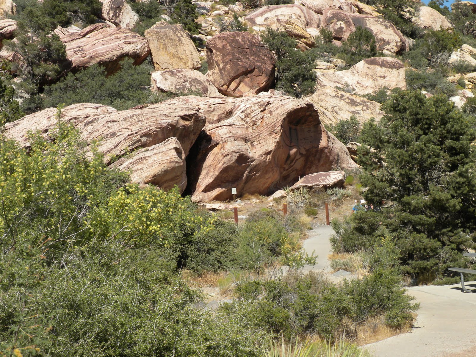


This is a snapshot of the scene. It's difficult to see the pictographs on the rock in this photo because they are located were the shadow side and light side meet at this time of day. I emphasized them in my painting though. This was another nice morning of painting as it included several interesting conversations with visitors. One family was from Israel and they told me that the topography of this valley is similar to that back home. Another family was from Japan and they were so appreciative of watercolor they made a point of showing it to their children before heading down the trail.

Tuesday, June 1, 2010

Sketchbook Pages


This is a photo of a watercolor sketch from last week. I bought the shell at PetSmart in their aquarium department just to have a new shell to play around with. I am using toned Rives BFK paper here - the tan shade - and I thought I might need a little white gouache for the whitest area of the shell. But I was surprised to find that I didn't need the white as the tan tone of the paper reads as a highlight next to the warm browns of burnt sienna and transparent oxide red. The transparent oxide red is from Daniel Smith and I added it to my watercolor palette after using it in my oil palette under advice from Richard Schmid in his book "Alla Prima". I really like this color and find it warms viridian to a wonderful earthy green and makes a good dark brown mixed with french ultramarine.


Another plein air watercolor sketch from about a week ago. Set up next to the road on the approach to the Pine Creek trailhead in Red Rock Canyon. Below you can see more of the landscape I'm viewing and my set-up. I took my umbrella down so the photo would have light on the sketchbook but normally I have the umbrella up.


This is a sketch from about two weeks ago. I was set up behind the old visitors center facing the Calico Hills. The hedge hog cactus were in bloom on this rocky hill and there were deep magenta blossoms all around me every 30 feet. They were gorgeous. Our brand new visitors center in Red Rock Canyon is wonderful by the way. After much planning and construction the new building opened in April. The habitat exhibits are fascinating and there is much to explore.

Saturday, March 20, 2010

Oil Painting In Stages


"Colorful Canyon"
6" x 8" Oil on Linen

I have been working on small oil studies lately and this is an example. It is a view into Pine Creek Canyon from the Overlook trail. I have included stages of development below from the monochromatic block-in through completion. I always enjoy seeing other artists work through their processes so I thought some of you might also like to see mine. The colors in these digital photos are more vivid than in the actual painting. I must learn how to calibrate my monitor soon. One more computer skill I have to tackle.


Thursday, February 18, 2010

Painting Snow in the Desert !


"Bridge Mountain Blues"
Oil on Linen
9" x 12"

We have had so many wonderful rain storms here in Las Vegas this winter and most of them left snow in the mountains for us to enjoy for weeks. I have been in heaven painting the beautiful snow and waterfalls of the Red Rock Canyon escarpment. The valley floor with all the dry washes full and rushing with the runoff are all so dramatic. I hardly knew what to paint first. Thank-you El Nino!


Early this winter I painted color charts for my oil palette. I have posted the chart for ultramarine blue deep above. The instructions for making these charts can be found in Richard Schmid's book "Alla Prima". This book can be see in the background of this photo and it is open to the pages that explain how to mix the colors. I used 1/4" masking tape between the squares of colors as advised. I made these charts on Gessobord which worked fine and they come in different sizes. I have pulled the tape off in the upper section so you can see the straight edges. The lower section where I am adding yellows and reds to the blue (to make green or purple squares) still has the tape on so the edges are still irregular. Of course these are oils so they take weeks to dry and you must pull the tape off while the paint is still fresh and wet.


This photo shows five of the seven charts I have finished. I still have 3 to 4 more to make. If you are thinking of starting to work in oils I highly recommend doing the charts. Each chart is dedicated to one color on your palette. This gessobord is 18"x 24" so there is plenty of room for two colors to be studied on one board. For example, yellow ochre is at the top section of the chart on the left side of the photo and burnt sienna is the section below it. That particular color is painted straight out of the tube and unmixed in the farthest left column. It is then mixed separately with each of the other colors on your palette. That new mixed color is painted in the square at the top of the next column. And that new mixed color is also mixed with white to four graduating values and each of those values is painted into a square going down the column. This has simplified the process of finding the right color, value and formula for any passage in a painting. It does take time to make the charts but it was truly worthwhile.

Thursday, December 24, 2009

Handmade Sketchbook Finished!


Here it is! The finished sketchbook open to a couple of watercolors that were painted before I put the pages together into the book. Below you will find the steps I went through since my last post to add the book block into the cover.

After pressing the cover between the boards for a couple of days it was properly dry. I squeezed glue onto the back board and brushed it out.

After placing the book block with it's cheesecloth spine down on the center of the cover I added a little more glue through the cheesecloth and brushed this out too.


Pieces of the same linen cloth used for the cover were then glued down to the mat board. They are called fillers. The cheesecloth is now sandwiched between the mat board and the linen filler.


Here, I'm brushing glue across pieces of Canson pastel paper which will be used for the end papers.


Those binder clips did a great job of holding the book block up vertically for me while I positioned the fillers and end papers and pressed and smoothed them down.


The burgundy colored end papers are a little too long at this point but I will tear them even with the other pages later. I placed sheets of newsprint to absorb moisture from the glue down directly on the end papers then wax paper next to protect the good drawings and painting pages from moisture. I also added some foam core to keep the cover up since it slants downward a little when closes. This kept the homesote boards horizontal once I put them down and weighted them.


The sketchbook is now between 2 homesote boards and more heavy art books placed on top to weigh the book down for final drying for a few days.


The open sketchbook two days later after drying. I have trimmed the end papers to the same width as the painting papers.


There are a few minor problems. In between the signatures there is a lot of space at the spine. I'll do the stitching a bit more snug next time.


The other problem is that the pages are a bit wider than the linen cover. I may not have gotten the book block glued in tightly enough against the cover spine. Bookbinding is definitely an art in itself. I'm looking forward to taking a workshop to improve on some of these details. But the sketchbook will still serve it's purpose quite well for me regardless of these little imperfections. I'm very much looking forward to filling it!


Sunday, November 22, 2009

Binding My Own Sketchbook!


I have decided to make my own sketchbook from art papers that are my favorite to paint on. The sketchbooks we buy from the art stores are very nice but I wanted one with a variety of Fabriano surfaces as well as some fine drawing papers like Rives BFK in several tones. Many of the pages already have paintings or sketches on them because I began forming the pages for this sketchbook by tearing and folding from larger sheets of paper months ago and then I started using them even though I hadn't bound them into the book yet.


This photo shows the book block after I have assembled all the signatures and the cheesecloth spine and then sewn them all together. A signature is a group of folded leaves, or pages, inserted one inside the next for binding. I'm using a good book to help guide me through this process called Books, Boxes, & Wraps by Marilyn Webberlye & JoAn Forsyth. I've never bound a book before so this is a whole new experience for me.

Here you can see that the space between the signature units when laid flat is probably a little too wide. I must have left too much slack in the thread when sewing them. I was concerned that if I pulled too tightly I might have trouble getting the pages to lay flat when open but I may have over compensated. I spent hours doing this step so I decided not to redo it. I'll just pay attention to this possible outcome with the next sketchbook I make.


Putting the glue on the mat boards I am using to make the cover. I'm using my cotton boards that are left over from matting paintings so the boards are archival. I bought a piece of linen from Joann Fabric Store for the fabric cover and that is precut, ironed and laid out in the center of my framing table.


Brushing the glue across the entire sheet of mat board.


Placing the mat board on the linen glue side down. I pressed down in the center and then in all four corners, flipped the cover over, placed a paper towel down and smoothed it with a bone folder. The folder takes out any air pockets and the paper towel is there to absorb any excess glue that might seep up through the fabric.


Here I am brushing glue on the turn-ins which are then folded over and pressed down on the board.


To dry overnight I have placed a sheet of homesote board down first. Next came a sheet of wax paper to protect the homesote. Then a slip sheet of newsprint. The book cover is next with newsprint over it, then another sheet of wax paper and another homesote board on top.


This photo shows the last step in making the case to set the signatures in. You see the stack of 2 boards that I have placed the case between and the books on top to weigh it down. Those heavy art history books come in handy. I left the sketchbook cover (also called the case) to dry overnight. In my next blog entry I'll show attaching the book block to this case.

This drying process is the same method I use to flatten my watercolors by the way, after they are finished. I set the painting face down on this same table because it is waterproof. I spread water across the back of the painting with a large hake brush and put a sheet of plastic over it while the water soaks in for about 15 minutes. If you haven't seen this process done before it is a good idea to test it first on a scrap watercolor because you must be careful not to put too much water down or it could soak through to the other side where your painting is. 300 lb. paper needs more water than 140lb. paper. But you must use enough water to cause the paper to relax. I put a clean piece of cloth cut from an old cotton sheet down on the homesote board, put the painting on top of that. Then another piece of cotton goes down on top of the painting. Finally another piece of homesote board is placed on top and heavy books on top of that. I usually leave the painting under these weights for a day and a half. The homesote board is what I use in printmaking to dry etchings after pulling an edition. It is a board which pulls moisture into itself. Flattening this way makes matting and framing the painting easier as you won't see buckling of the painting under the edges of your window mat.

I'm having a lot of fun with this and I can hopefully finish it soon! Stay tuned for the next installment of my book binding!

Wednesday, October 28, 2009


"Apache Plume and Purple Sage"
9" x 13" original watercolor

This little watercolor was done in July and I intended to have it at the show in October but I ran out of time to mat or frame most of the paintings done in late summer. It is on Fabriano Extra White 140 lb. cold press. The scene is one I keep going back to because I am inspired by the mountains in Red Rock Canyon and also by the thick desert flora. I used small dashes of miskit for the flowers on the shrubs in order to preserve their light and after finishing the majority of the landscape I went back and put in the flower details at the end. The Apache Plume (in the middle ground right with the whitish blossoms) is an interesting plant because it's flower resembles a miniature five-petaled rose. But as many as 25 seed plumes develop and they look like tufts of feathers. They give the plant a soft, fluffy appearance which is a nice change from the yuccas and spiney cactus. We've seen these profuse "feather" shows in shades of delicate lime green, cream, pink and deep pink. An artist can't resist painting scenes like this.